
 All projects
SOLEM - Onboarding
A first-launch experience that asks about the user’s profile, needs and goals — then adapts the MySOLEM app around them from the moment of sign up.
OVERVIEW
About the project
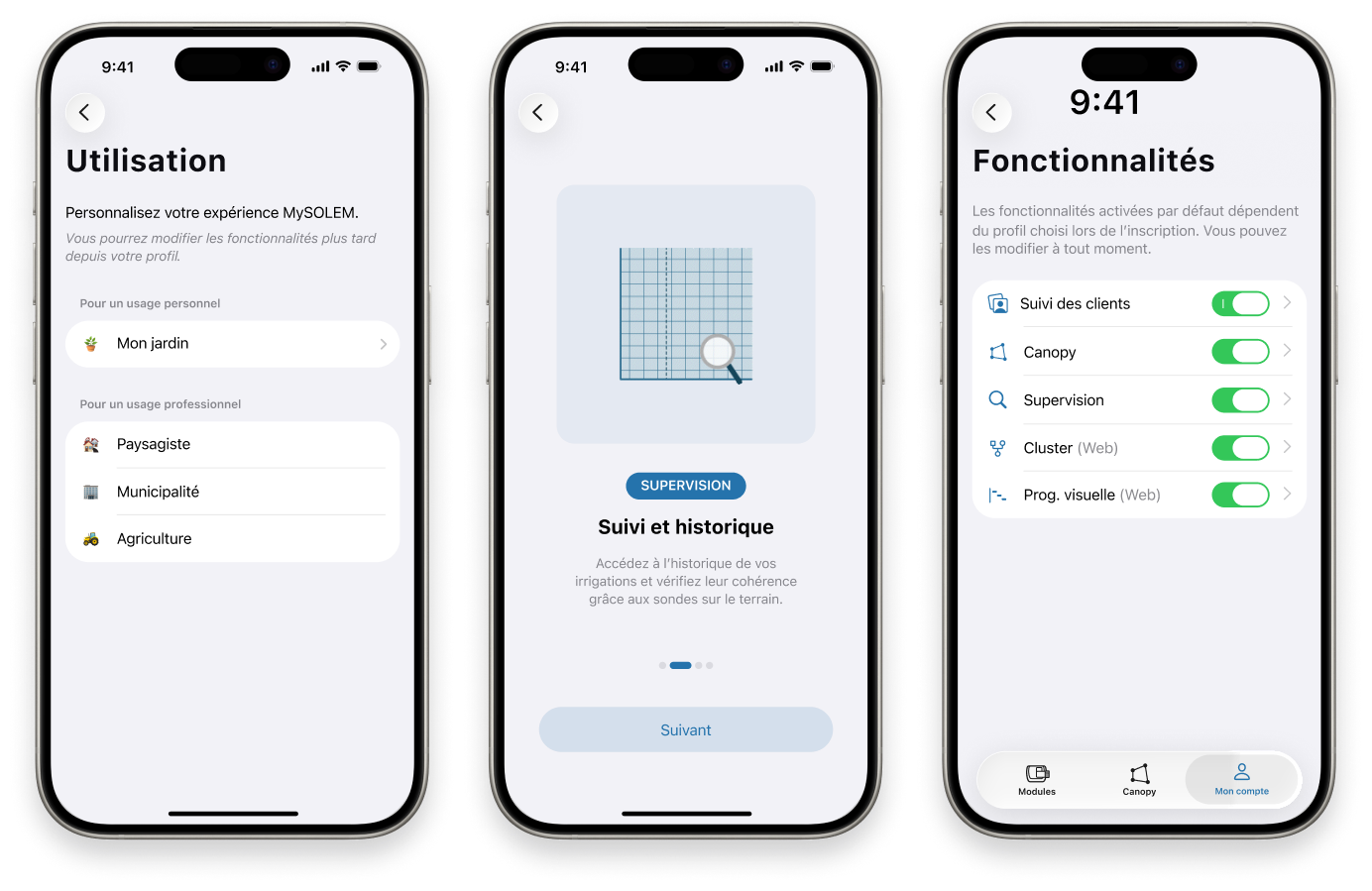
I designed a personalized onboarding flow within the MySOLEM app. On first launch, the user is invited to create an account, sharing their type of profile, needs and goals, so the experience can adapt to how they will actually use the product.
THE PROBLEM
One user-flow can’t fit everyone
MySOLEM users have very different profiles and needs. A single, one-size-fits-all onboarding and interface couldn’t respond effectively to every situation.
For many users, getting started was complex: they were seeing features they didn’t need in the app, and the interface was not always adapted for their specific profile.
OBJECTIVES
What needed to be achieved
✅ Identify the user’s profile as soon as they arrive.
✅ Surface the features most relevant to their context.
✅ Speed up getting started with the app.
✅ Reduce the complexity people feel while discovering the product.
PROCESS
Designing for difference
I used the design-thinking process to turn a generic user flow into one that adapts to who is actually using it.
Empathize
Understanding before deciding
Before designing anything, I first had to identify and understand the people who use the MySOLEM app. I ran observations and usability research and gathered both qualitative and quantitative insights into users’ behaviors, motivations, pain points and goals; collecting raw research, not yet conclusions.
✅ Observed how different users set up and run irrigation on the existing app, from a single home controller to large professional installations.
✅ Captured each profile’s context, motivations and day-to-day tasks.
✅ Combined qualitative insight with usage data to see where people struggled in their first session.
Define
Four profiles, one friction
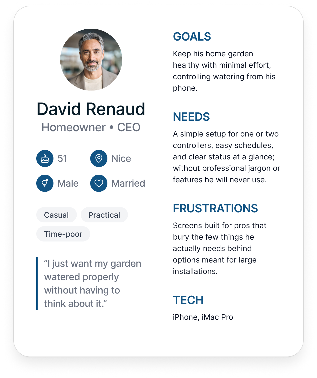
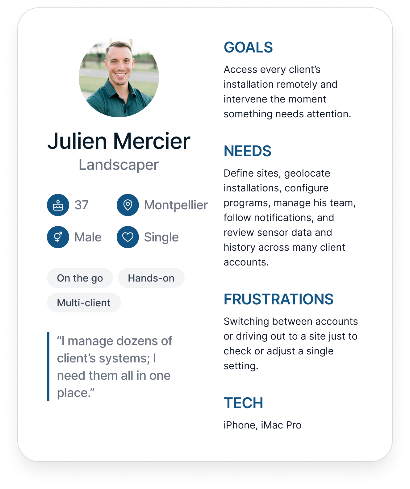
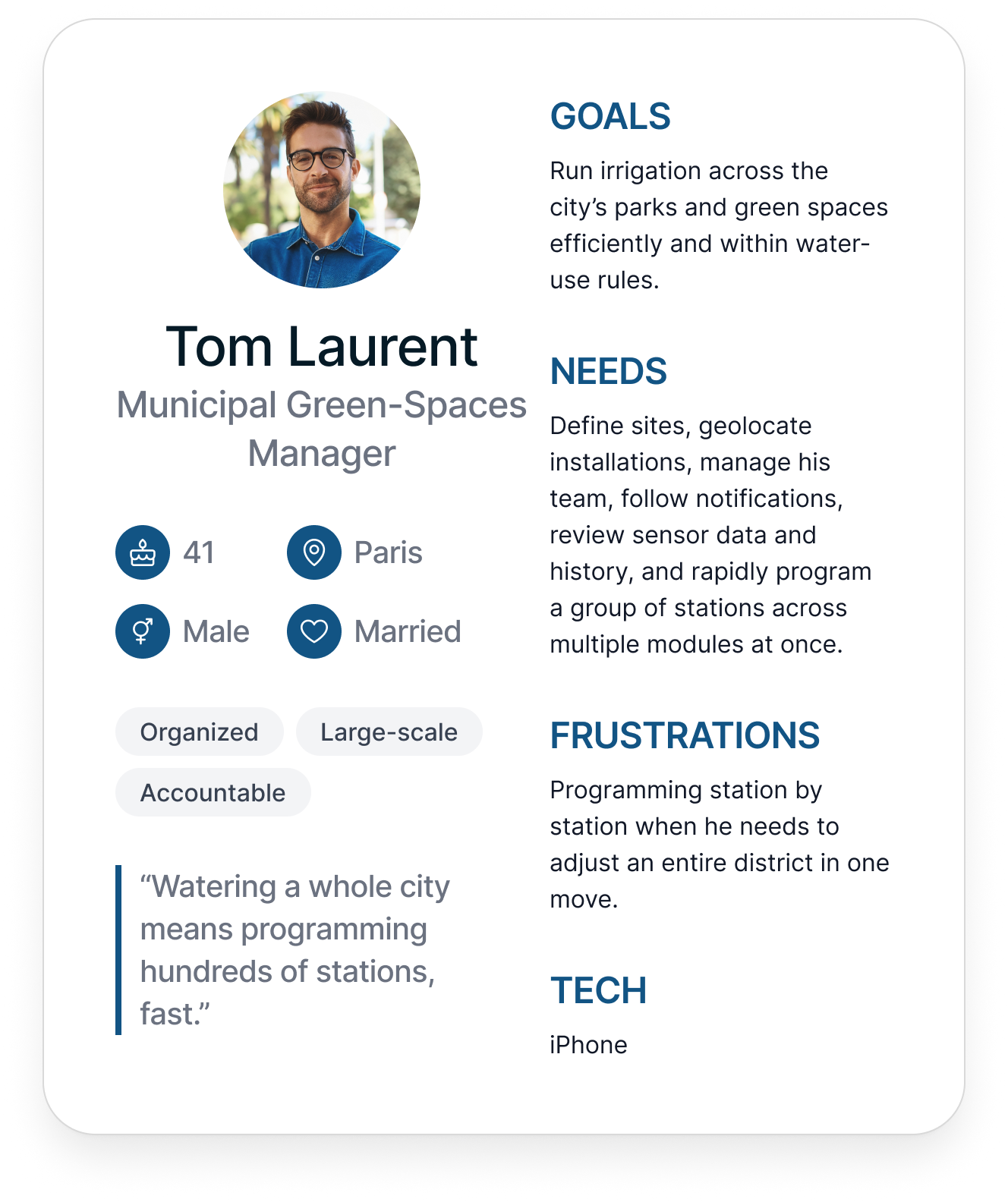
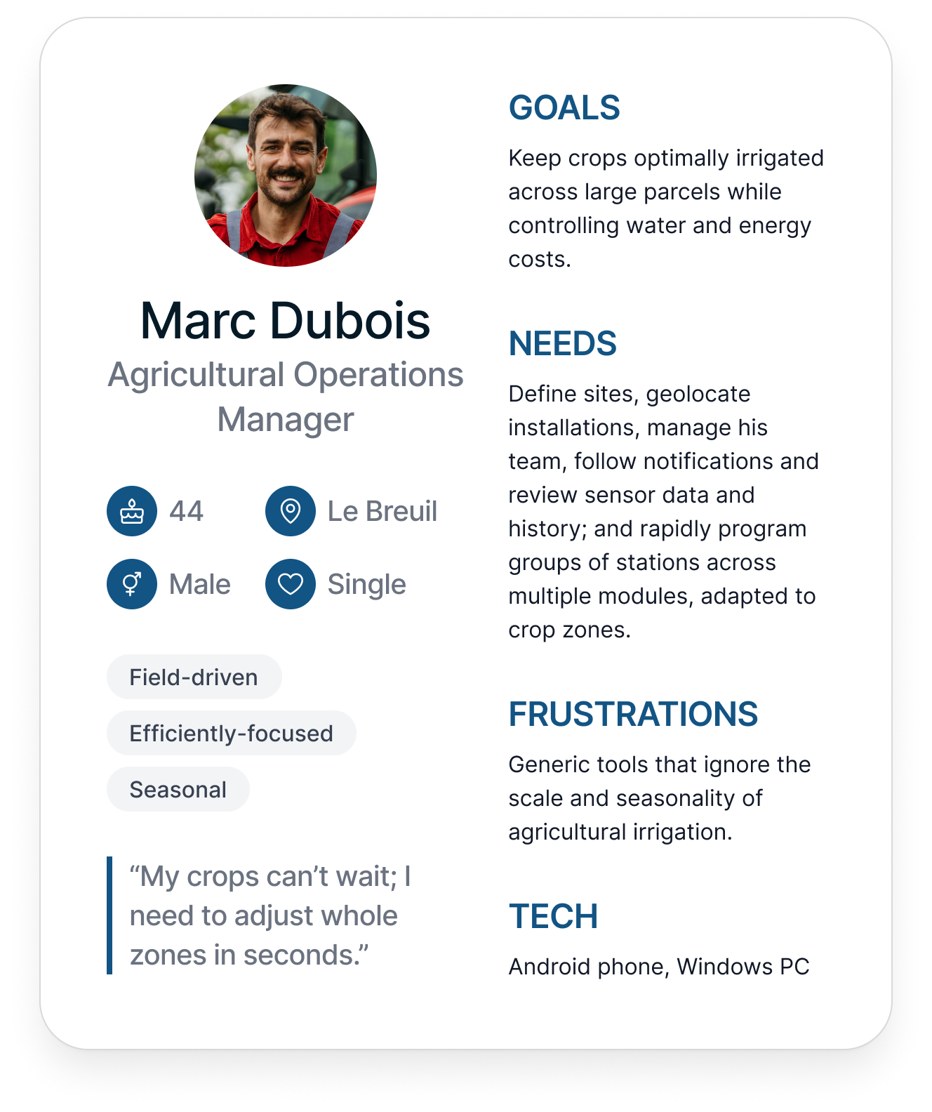
I analyzed and synthesized the research, looking for patterns across users. Those patterns resolved into four key user groups, which I captured as personas that let me frame the real problem as a “how might we” question instead of an assumption.
✅ Synthesized the research and clustered participants by goals, context and the depth of control they needed.
✅ Built four personas, one B2C and three B2B, to represent the key groups.
✅ Reframed the problem around those personas rather than a generic “new user”.
How might we welcome a homeowner and a professional through the same door, without overwhelming one or understanding the other?
Ideate
Branch on profile, early
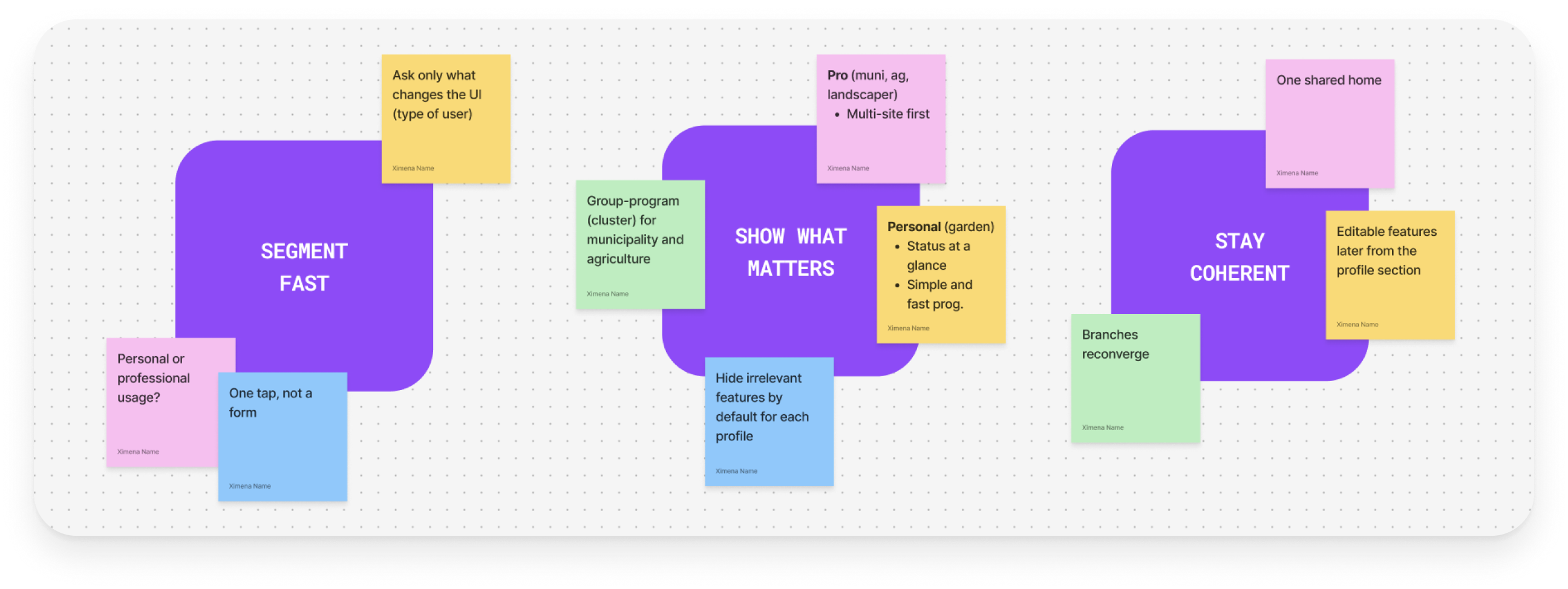
After creating the personas, I brainstormed ideas to generate solutions tied to each group’s goals and pain points.
✅ Generated ideas for each persona’s goals and frusutrations.
✅ Converged on an early, lightweight usage question that segments without feeling like a form.
✅ Mapped which features each persona should meet first, and how the branches reconverge to one home.
Prototype
An adaptive first run
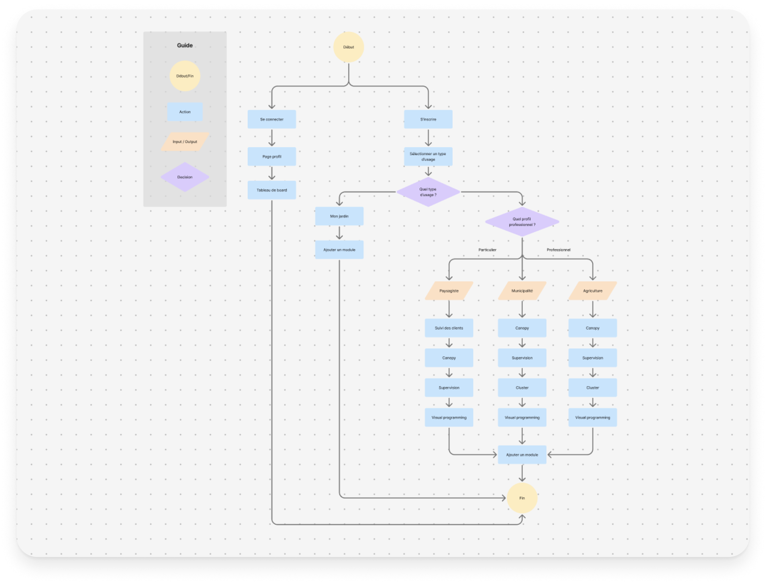
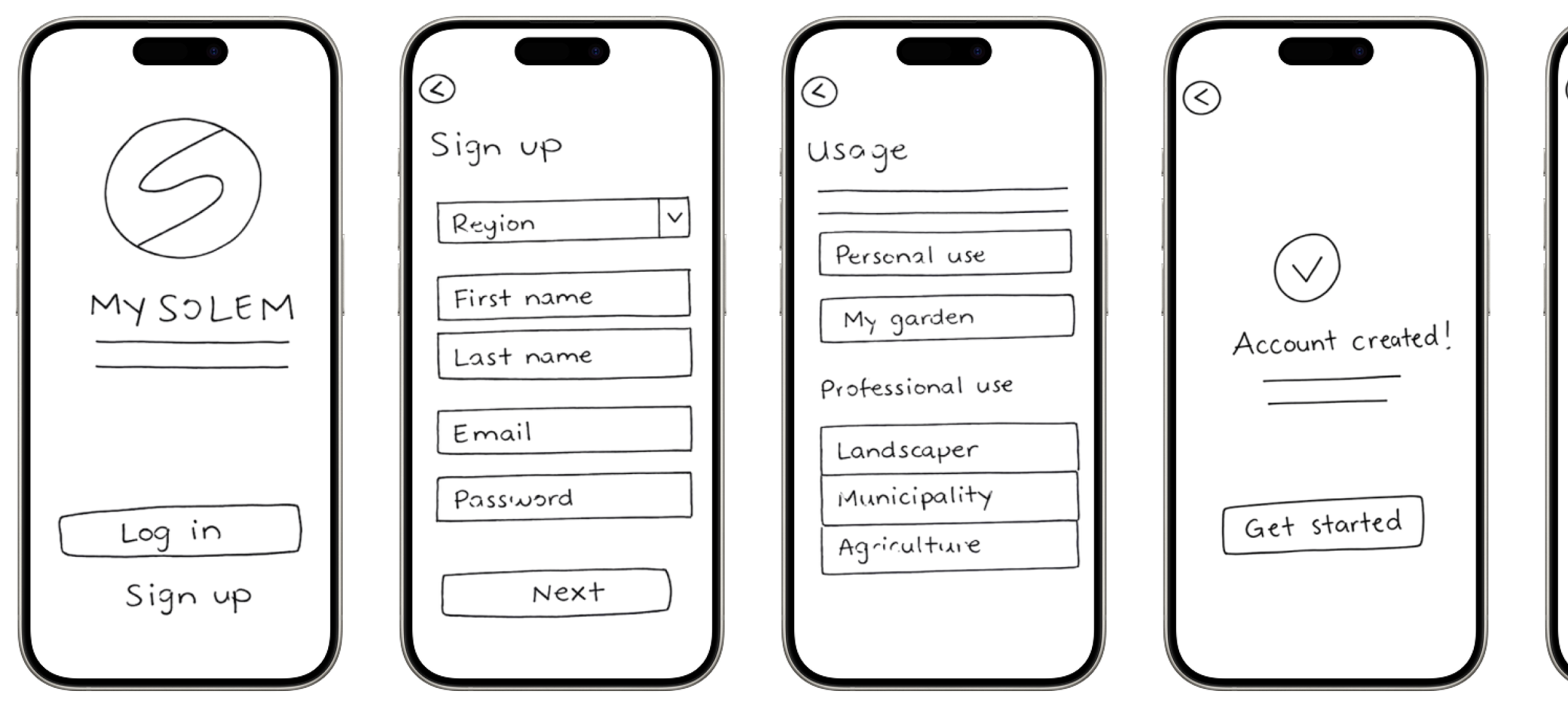
I translated the chosen direction into a user-flow and then low and mid-fidelity wireframes, designing each screen with the personas in mind so each type of user land somewhere built for them.
✅ Mapped the adaptive user-flow: one usage question that diverges into tailored paths, then reconverges.
✅ Sketched low and mid-fidelity wireframes for the welcome, usage selection and features.
✅ Kept the flow short, highlighting features and starter actions for each user selection.
Low-fidelity wireframes
Test
Validate with real users
I tested the prototype with real users to check the personalized flow actually worked for the people it was built for. Findings fed straight back into the design, and into slightly refining the personas.
✅ Tested the flow with users matching each persona to confirm they reached a relevant interface quickly.
✅ Watched for friction in the usage question and the first tailored actions.
✅ Used the findings to refine the flow and sharpen the personas.
THE SOLUTION
An adaptive onboarding
An onboarding at the moment of sign up built around what the user tells us about their profile and usage, to provide them with the most useful and adapted features.

Defining the user-flow
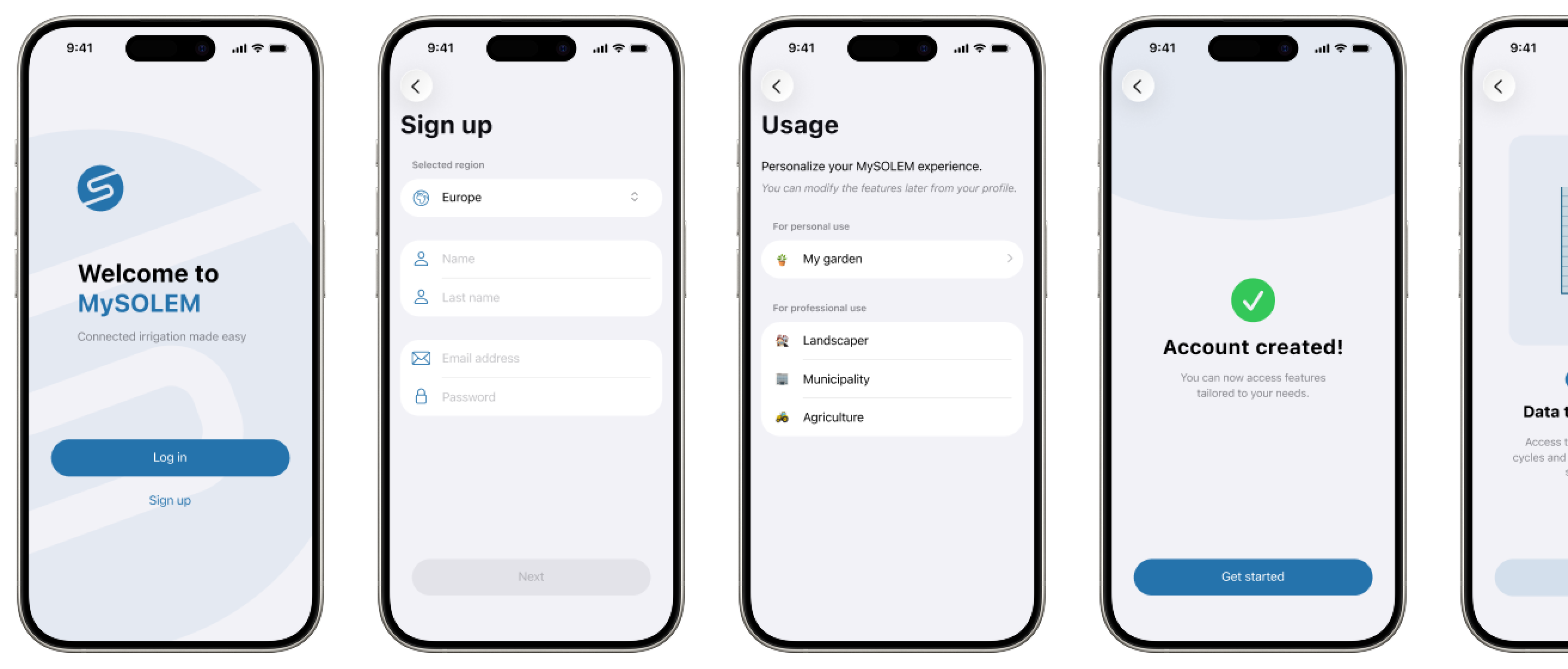
The initial steps of the sign-up user-flow is the same for every user at first. But later down the path, the user gets asked to choose their kind of profile in order to personalize their MySOLEM experience → the basis for everything that follows.
An experience shaped to fit, relevant from the first session
Available features adjust to the user’s profile, putting the most relevant ones front and center. Because the suggested paths match how each user will actually use MySOLEM, getting started feels faster and less complex.
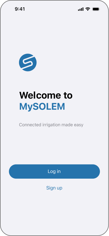
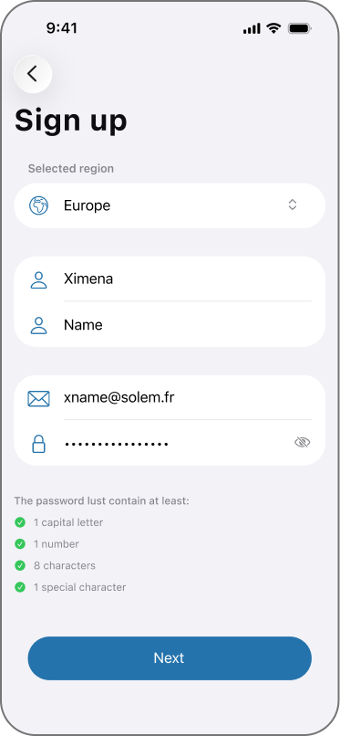
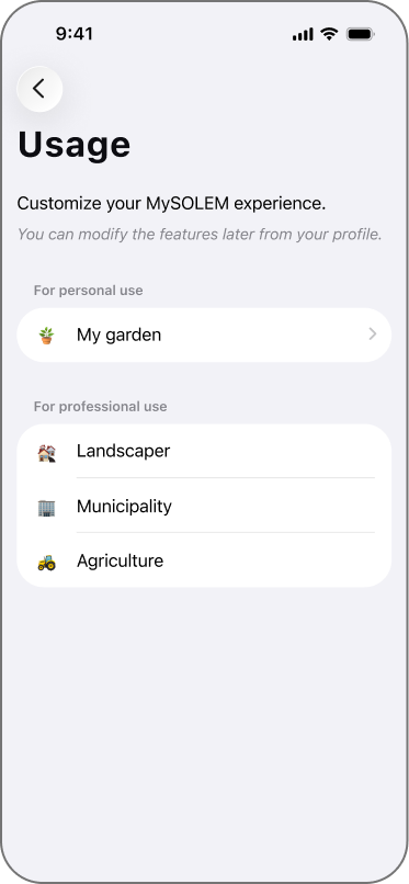
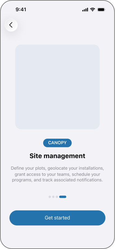
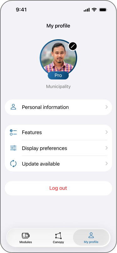
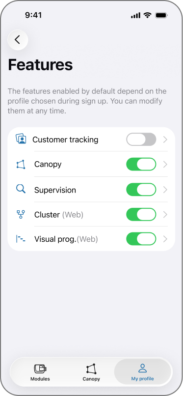
High-fidelity wireframes
DESIGN DECISIONS
Choices & rationale

Asking before assuming
Asking the user who they are up front let the app adapt to them, instead of guessing or defaulting everyone to the same generic user-flow.

Branch early, reconverge
The flow diverges by profile and then returns to a common home, so personalization tailors the start without fragmenting the rest of the product.

Relevance over completeness
Each profile sees the features that matter to them first, rather than a full walkthrough of every feature the app can do.
REFLECTION
What I took away
Personalization isn’t more screens, it’s the right screens. Asking a or a few specific questions about the user up front let the app stop explaining things that didn’t apply to that specific user.