
 All projects
SOLEM - Design System
A centralized design system for the MySOLEM platform: reusable components, text and color tokens, and documented rules that give design and development a shared language.
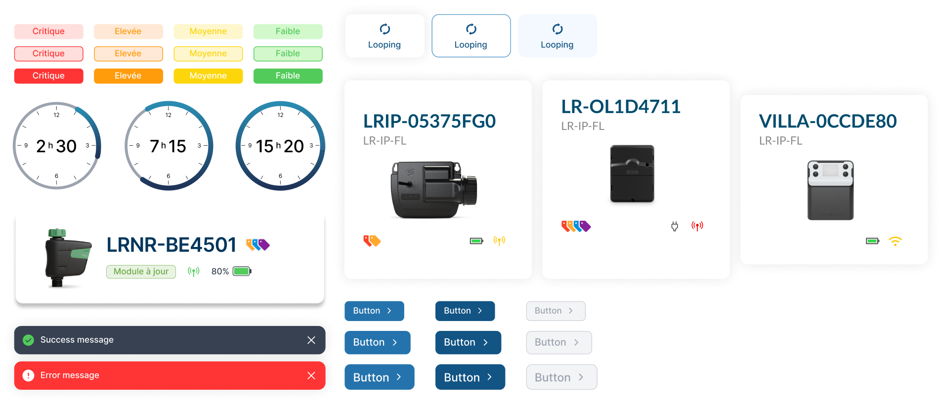
OVERVIEW
About the project
I created a centralized design system for MySOLEM, bringing together reusable components, text styles, color variables and a common set of design rules — the shared foundation the platform had been missing.
THE PROBLEM
Without a system, every screen drifted
The platform had grown for years without a design system, and it showed. Visual and functional inconsistencies crept in across screens, and teams relied on no reusable components.
That slowed everything down: design took longer, development re-implemented the same patterns differently, and maintaining the product became harder with every release.
OBJECTIVES
What needed to be achieved
✅ Guarantee visual consistency across the platform.
✅ Speed up the production of mockups.
✅ Simplify how the product evolves and is maintained.
✅ Make collaboration between designers and developers easier.
✅ Give technical teams clear, usable documentation.
PROCESS
Building the system
I treated the design system as a product in its own right: audited first, built on solid foundations, then documented and rolled out.
Audit
Inventoried every screen, possible component and style across MySOLEM, cataloguing the inconsistencies and the places reusable patterns were missing.
Foundations
Designed the base layer first (color variables, typography styles, spacing, grids) as the single source the rest would inherit from.
Components
Built the reusable library (buttons, inputs, cards, navigation and more) as a flexible, variant-driven components mapped to development.
Documentation
Wrote usage guidelines with clear do’s and don’ts and paired each component with specs the technical teams could act on directly.
Adoption
Worked alongside designers and developers to roll the system into the product and make it the default starting point for new work.
THE SOLUTION
A scalable, documented system
I built an evolving design system with the pieces teams could actually rely on, and the rules to keep them consistent.

A reusable component library
Buttons, inputs, cards, navigation and more — built as flexible, variant-driven components so teams compose screens instead of rebuilding them.
Color & typography variables
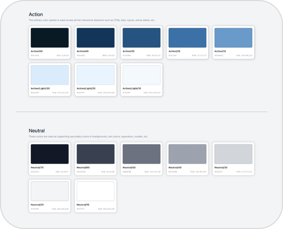
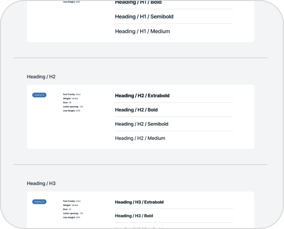
Shared color and typography variables act as the single source of truth, so a change ripples safetly and consistency across every interface.
Documented usage rules
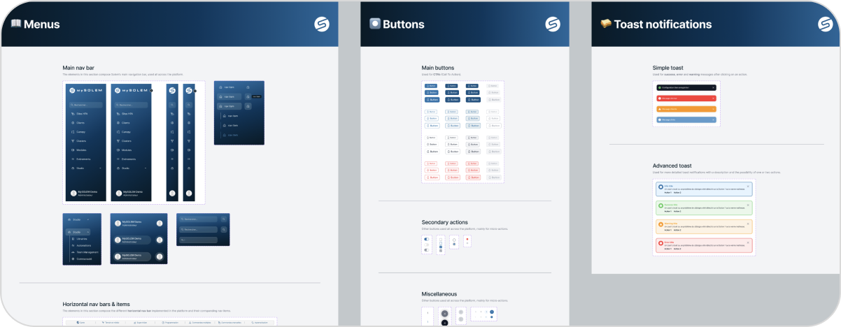
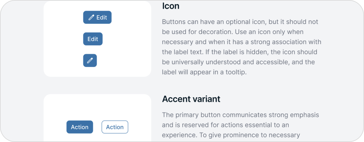
Each pattern pairs a live example with clear do’s and don’ts, giving designers and developers a common reference and keeping the whole product harmonized.
DESIGN DECISIONS
Choices & rationale

Tokens before components
I defined color and type variables first, so every component inherits from one source and a single change propagates safely across the platform.

Variants, not duplicates
Each component carries its own states and variants instead of living as separate copies, which keeps the Figma library and the code 1:1.

Documentation as a deliverable
Usage rules shipped with the library, not after it. A system only stays consistent if every contributor knows how to use it correctly.
REFLECTION
What I took away
A design system is only as strong as its adoption. The library mattered, but the real work was documenting it clearly it clearly and making it the easiest path for both designers and developers to follow.